" height="20.16558px" id="Gouv5GxYo" transform="translate(2.324 1.519)" width="21.32213px"/><path d="M 0.017 7.864 C 0.017 6.649 0.202 5.569 0.556 4.607 C 0.909 3.645 1.415 2.818 2.072 2.143 C 2.728 1.468 3.52 0.928 4.463 0.557 C 5.406 0.186 6.451 0 7.613 0 C 8.573 0 9.448 0.169 10.223 0.506 C 10.998 0.844 11.655 1.333 12.194 1.958 C 12.733 2.582 13.154 3.341 13.457 4.236 C 13.76 5.13 13.895 6.109 13.895 7.206 L 4.699 7.357 C 4.8 8.032 4.968 8.674 5.221 9.264 C 5.474 9.855 5.811 10.361 6.265 10.783 C 6.72 11.205 7.276 11.526 7.933 11.728 C 8.589 11.931 9.381 12.015 10.307 11.964 C 10.712 11.931 11.183 11.728 11.739 11.374 C 12.295 11.019 12.8 10.462 13.322 9.703 L 13.81 10.125 C 13.423 10.884 12.952 11.526 12.379 12.066 C 11.806 12.606 11.217 13.027 10.594 13.365 C 9.971 13.702 9.347 13.956 8.707 14.107 C 8.067 14.259 7.495 14.344 6.956 14.344 C 5.895 14.344 4.935 14.192 4.076 13.888 C 3.217 13.584 2.493 13.146 1.886 12.606 C 1.28 12.066 0.825 11.374 0.488 10.581 C 0.151 9.787 0 8.893 0 7.914 Z M 4.615 6.362 L 8.168 6.362 C 8.674 6.345 9.078 6.21 9.381 5.94 C 9.684 5.67 9.886 5.366 9.987 4.995 C 10.088 4.624 10.122 4.202 10.072 3.763 C 10.021 3.324 9.869 2.919 9.634 2.548 C 9.398 2.177 9.095 1.873 8.707 1.62 C 8.32 1.367 7.882 1.249 7.377 1.249 C 6.518 1.249 5.827 1.721 5.322 2.649 C 4.817 3.577 4.581 4.809 4.615 6.345 Z" fill="rgb(247, 74, 44)" height="14.343789999999998px" id="piCbKiSMM" transform="translate(23.646 7.375)" width="13.8947px"/><path d="M 0.017 7.864 C 0.017 6.649 0.202 5.569 0.556 4.607 C 0.909 3.645 1.415 2.818 2.072 2.143 C 2.728 1.468 3.52 0.928 4.463 0.557 C 5.406 0.186 6.45 0 7.613 0 C 8.573 0 9.448 0.169 10.223 0.506 C 10.998 0.844 11.655 1.333 12.194 1.958 C 12.733 2.582 13.154 3.341 13.457 4.236 C 13.76 5.13 13.895 6.109 13.895 7.206 L 4.699 7.357 C 4.8 8.032 4.968 8.674 5.221 9.264 C 5.474 9.855 5.81 10.361 6.265 10.783 C 6.72 11.205 7.276 11.526 7.933 11.728 C 8.589 11.931 9.381 12.015 10.307 11.964 C 10.712 11.931 11.183 11.728 11.739 11.374 C 12.295 11.019 12.8 10.462 13.322 9.703 L 13.81 10.125 C 13.423 10.884 12.952 11.526 12.379 12.066 C 11.806 12.606 11.217 13.027 10.594 13.365 C 9.97 13.702 9.347 13.956 8.707 14.107 C 8.067 14.259 7.495 14.344 6.956 14.344 C 5.895 14.344 4.935 14.192 4.076 13.888 C 3.217 13.584 2.493 13.146 1.886 12.606 C 1.28 12.066 0.825 11.374 0.488 10.581 C 0.152 9.787 0 8.893 0 7.914 Z M 4.615 6.362 L 8.168 6.362 C 8.674 6.345 9.078 6.21 9.381 5.94 C 9.684 5.67 9.886 5.366 9.987 4.995 C 10.088 4.624 10.122 4.202 10.072 3.763 C 10.021 3.324 9.869 2.919 9.634 2.548 C 9.398 2.177 9.095 1.873 8.707 1.62 C 8.32 1.367 7.882 1.249 7.377 1.249 C 6.518 1.249 5.827 1.721 5.322 2.649 C 4.817 3.577 4.581 4.809 4.615 6.345 Z" fill="rgb(247, 74, 44)" height="14.343789999999998px" id="HDdXCJIow" transform="translate(37.76 7.375)" width="13.894799999999996px"/><path d="M 0.017 21.414 L 0.017 20.52 L 0.32 20.486 C 0.859 20.419 1.28 19.98 1.6 19.136 C 1.92 18.293 2.072 17.196 2.072 15.862 L 2.072 8.117 C 2.072 7.172 2.055 6.412 2.004 5.822 C 1.954 5.231 1.886 4.759 1.752 4.371 C 1.617 3.982 1.448 3.696 1.213 3.459 C 0.977 3.223 0.691 3.021 0.32 2.835 L 0.017 2.683 L 0.017 2.379 L 5.457 0.152 L 6.299 0.152 L 6.299 1.536 C 6.619 1.131 7.191 0.776 8 0.473 C 8.808 0.169 9.752 0 10.813 0 C 11.655 0 12.446 0.202 13.187 0.591 C 13.928 0.979 14.568 1.519 15.09 2.211 C 15.613 2.902 16.034 3.729 16.32 4.691 C 16.606 5.653 16.741 6.716 16.691 7.881 C 16.657 8.944 16.404 9.872 15.949 10.682 C 15.495 11.492 14.922 12.15 14.232 12.707 C 13.541 13.264 12.783 13.652 11.941 13.922 C 11.099 14.192 10.291 14.327 9.465 14.327 C 8.859 14.327 8.286 14.259 7.73 14.107 C 7.175 13.956 6.686 13.719 6.265 13.399 L 6.265 15.356 C 6.265 16.014 6.299 16.656 6.383 17.263 C 6.467 17.871 6.585 18.411 6.737 18.866 C 6.888 19.322 7.074 19.71 7.293 19.997 C 7.511 20.284 7.747 20.436 8.017 20.469 L 8.354 20.503 L 8.354 21.077 L 8.354 21.414 L 0 21.414 Z M 6.333 10.125 L 6.333 11.154 C 6.552 11.678 6.872 12.083 7.259 12.386 C 7.646 12.69 8.067 12.842 8.488 12.876 C 9.549 12.909 10.392 12.572 11.015 11.829 C 11.638 11.087 11.941 10.041 11.941 8.674 C 11.941 7.712 11.823 6.801 11.587 5.94 C 11.352 5.079 11.032 4.337 10.627 3.713 C 10.223 3.088 9.752 2.616 9.213 2.312 C 8.674 2.008 8.101 1.907 7.495 2.025 C 7.191 2.092 6.939 2.194 6.737 2.329 C 6.535 2.464 6.383 2.616 6.282 2.751 L 6.282 9.872 C 6.282 9.956 6.282 10.057 6.316 10.159 Z" fill="rgb(247, 74, 44)" height="21.4144px" id="JvJ6dDb67" transform="translate(50.778 7.341)" width="16.7009144593489px"/><path d="M 0.017 20.993 L 0.017 20.048 L 0.337 20.014 C 0.943 19.946 1.398 19.457 1.718 18.512 C 2.038 17.567 2.19 16.403 2.19 14.968 C 2.19 13.989 2.156 13.179 2.105 12.555 C 2.055 11.931 1.954 11.424 1.819 11.036 C 1.684 10.648 1.499 10.328 1.246 10.091 C 0.994 9.855 0.691 9.636 0.32 9.433 L 0.034 9.281 L 0.034 9.18 C 0.034 9.18 0 9.062 0 8.961 L 5.726 6.632 L 6.602 6.632 L 6.602 15.171 C 6.602 16.571 6.77 17.719 7.107 18.596 C 7.444 19.474 7.882 19.946 8.421 20.014 L 8.775 20.048 L 8.775 20.993 L 0 20.993 Z M 1.718 2.514 C 1.718 1.738 1.937 1.131 2.375 0.675 C 2.813 0.219 3.419 0 4.16 0 C 4.901 0 5.474 0.219 5.912 0.675 C 6.35 1.131 6.568 1.738 6.568 2.514 C 6.568 3.291 6.35 3.898 5.912 4.354 C 5.474 4.809 4.884 5.029 4.16 5.029 C 3.436 5.029 2.813 4.809 2.375 4.354 C 1.937 3.898 1.718 3.291 1.718 2.514 Z" fill="rgb(247, 74, 44)" height="20.992516000000002px" id="ziOdid7qO" transform="translate(66.577 0.709)" width="8.77470000000001px"/><path d="M 8.792 21.077 L 0.017 21.077 L 0.017 20.132 L 0.354 20.132 C 0.926 20.047 1.347 19.558 1.684 18.681 C 2.021 17.803 2.189 16.656 2.189 15.255 L 2.189 8.336 C 2.189 7.357 2.156 6.547 2.105 5.923 C 2.055 5.299 1.954 4.792 1.819 4.404 C 1.684 4.016 1.499 3.696 1.246 3.459 C 0.994 3.223 0.691 3.004 0.32 2.801 L 0.034 2.649 L 0.034 2.548 C 0.034 2.548 0 2.43 0 2.329 L 5.726 0 L 6.602 0 L 6.602 13.196 L 7.326 12.572 C 8.926 11.188 10.105 10.057 10.897 9.163 C 11.688 8.269 11.975 7.796 11.756 7.712 C 11.672 7.678 11.638 7.611 11.638 7.56 L 11.638 6.733 L 16.792 6.733 L 16.792 7.678 L 16.421 7.712 C 15.899 7.746 15.124 8.066 14.114 8.657 C 13.103 9.247 11.924 10.024 10.611 11.019 L 14.248 15.896 C 15.208 17.128 16.135 18.141 17.01 18.9 C 17.886 19.659 18.611 20.064 19.183 20.115 L 19.554 20.149 L 19.554 21.094 L 10.375 21.094 L 10.375 20.149 L 10.56 20.115 C 10.897 20.047 10.846 19.575 10.425 18.681 C 10.004 17.786 9.246 16.656 8.185 15.272 C 7.916 14.917 7.646 14.563 7.394 14.226 C 7.141 13.888 6.888 13.551 6.602 13.179 L 6.602 15.255 C 6.602 16.656 6.77 17.803 7.107 18.681 C 7.444 19.558 7.882 20.031 8.421 20.098 L 8.775 20.132 L 8.775 21.077 Z" fill="rgb(247, 74, 44)" height="21.093788px" id="nIiHxQBUx" transform="translate(74.644 0.625)" width="19.553699999999992px"/><path d="M 0.051 10.627 C 0.051 9.733 0.32 8.99 0.876 8.433 C 1.432 7.877 2.105 7.421 2.897 7.117 C 3.688 6.813 4.547 6.577 5.423 6.442 C 6.299 6.307 7.091 6.24 7.765 6.206 L 7.765 3.81 C 7.765 3.033 7.664 2.409 7.478 1.936 C 7.293 1.464 7.006 1.228 6.669 1.228 C 5.996 1.228 5.507 1.565 5.187 2.223 C 4.867 2.881 4.8 3.759 4.935 4.856 C 4.531 4.957 4.16 5.041 3.806 5.109 C 3.453 5.176 3.133 5.193 2.779 5.193 C 2.459 5.193 2.122 5.16 1.768 5.109 C 1.415 5.058 1.027 4.957 0.573 4.856 C 0.472 4.13 0.573 3.472 0.876 2.865 C 1.179 2.257 1.651 1.734 2.274 1.295 C 2.897 0.856 3.672 0.536 4.581 0.3 C 5.491 0.063 6.518 -0.038 7.63 0.013 C 9.061 0.046 10.207 0.502 11.049 1.346 C 11.891 2.19 12.329 3.354 12.329 4.839 L 12.329 10.155 C 12.329 10.813 12.413 11.336 12.581 11.741 C 12.75 12.146 13.07 12.348 13.541 12.348 C 13.895 12.348 14.165 12.298 14.367 12.18 C 14.569 12.061 14.72 11.91 14.821 11.707 L 15.276 12.298 C 14.906 12.973 14.384 13.513 13.676 13.918 C 12.969 14.323 11.941 14.525 10.577 14.525 C 9.971 14.525 9.432 14.39 8.977 14.12 C 8.522 13.85 8.219 13.479 8.051 13.006 C 7.512 13.361 6.888 13.665 6.147 13.951 C 5.406 14.238 4.632 14.373 3.806 14.373 C 3.234 14.373 2.712 14.272 2.24 14.07 C 1.768 13.867 1.364 13.597 1.044 13.26 C 0.724 12.922 0.455 12.534 0.269 12.078 C 0.084 11.623 0 11.167 0 10.695 Z M 4.379 9.918 C 4.379 10.644 4.598 11.184 5.036 11.572 C 5.474 11.96 5.979 12.146 6.518 12.146 C 6.989 12.146 7.411 12.011 7.815 11.741 L 7.781 7.066 C 7.344 7.066 6.939 7.117 6.535 7.218 C 6.131 7.32 5.777 7.488 5.44 7.725 C 5.103 7.961 4.851 8.265 4.665 8.619 C 4.48 8.973 4.379 9.412 4.379 9.918 Z" fill="rgb(247, 74, 44)" height="14.525237603498727px" id="vJJlJbLBp" transform="translate(92.85 7.379)" width="15.2757px"/><path d="M 0.051 10.627 C 0.051 9.733 0.32 8.99 0.876 8.433 C 1.432 7.876 2.106 7.421 2.897 7.117 C 3.689 6.813 4.548 6.577 5.424 6.442 C 6.299 6.307 7.091 6.24 7.765 6.206 L 7.765 3.81 C 7.765 3.033 7.664 2.409 7.478 1.936 C 7.293 1.464 7.007 1.228 6.67 1.228 C 5.996 1.228 5.508 1.565 5.188 2.223 C 4.868 2.881 4.8 3.759 4.935 4.856 C 4.531 4.957 4.16 5.041 3.807 5.109 C 3.453 5.176 3.133 5.193 2.779 5.193 C 2.459 5.193 2.123 5.16 1.769 5.109 C 1.415 5.058 1.028 4.957 0.573 4.856 C 0.472 4.13 0.573 3.472 0.876 2.865 C 1.179 2.257 1.651 1.734 2.274 1.295 C 2.897 0.856 3.672 0.536 4.581 0.3 C 5.491 0.063 6.518 -0.038 7.63 0.013 C 9.061 0.046 10.207 0.502 11.049 1.346 C 11.891 2.19 12.329 3.354 12.329 4.839 L 12.329 10.155 C 12.329 10.813 12.413 11.336 12.581 11.741 C 12.75 12.146 13.07 12.348 13.541 12.348 C 13.895 12.348 14.165 12.298 14.367 12.18 C 14.569 12.061 14.72 11.91 14.821 11.707 L 15.276 12.298 C 14.906 12.973 14.384 13.513 13.676 13.918 C 12.969 14.323 11.941 14.525 10.577 14.525 C 9.971 14.525 9.432 14.39 8.977 14.12 C 8.523 13.85 8.219 13.479 8.051 13.006 C 7.512 13.361 6.889 13.665 6.148 13.951 C 5.407 14.238 4.632 14.373 3.807 14.373 C 3.234 14.373 2.712 14.272 2.24 14.07 C 1.769 13.867 1.365 13.597 1.045 13.26 C 0.725 12.922 0.455 12.534 0.27 12.078 C 0.085 11.623 0 11.167 0 10.695 Z M 4.379 9.918 C 4.379 10.644 4.598 11.184 5.036 11.572 C 5.474 11.96 5.979 12.146 6.518 12.146 C 6.99 12.146 7.411 12.011 7.815 11.741 L 7.781 7.066 C 7.344 7.066 6.939 7.117 6.535 7.218 C 6.131 7.32 5.777 7.488 5.44 7.725 C 5.104 7.961 4.851 8.265 4.666 8.619 C 4.48 8.973 4.379 9.412 4.379 9.918 Z" fill="rgb(247, 74, 44)" height="14.525193357837816px" id="UJS_JlugN" transform="translate(107.722 7.396)" width="15.27600000000001px"/><path d="M 0.017 19.794 C 0.017 19.558 0.017 19.423 0.05 19.356 L 0.05 19.204 L 0.37 19.17 C 0.943 19.103 1.381 18.63 1.701 17.753 C 2.021 16.875 2.19 15.728 2.19 14.327 L 2.19 5.822 C 2.19 4.421 2.021 3.274 1.701 2.396 C 1.381 1.519 0.926 1.046 0.37 0.979 L 0.05 0.945 L 0.05 0.793 C 0.05 0.793 0.017 0.591 0.017 0.354 L 0.017 0 L 10.981 0 C 12.295 0 13.491 0.135 14.568 0.388 C 15.646 0.641 16.556 1.012 17.297 1.485 C 18.038 1.957 18.627 2.531 19.048 3.206 C 19.47 3.881 19.655 4.641 19.655 5.468 C 19.655 6.075 19.554 6.683 19.335 7.29 C 19.116 7.897 18.813 8.454 18.408 8.978 C 18.004 9.501 17.499 9.956 16.893 10.361 C 16.286 10.766 15.613 11.087 14.872 11.323 C 15.208 11.728 15.579 12.201 16 12.741 C 16.421 13.281 16.859 13.854 17.33 14.445 C 17.802 15.036 18.307 15.626 18.83 16.2 C 19.352 16.774 19.874 17.314 20.396 17.769 C 20.918 18.225 21.457 18.596 21.979 18.883 C 22.501 19.17 23.023 19.305 23.495 19.305 L 23.495 20.132 L 21.861 20.132 C 20.514 20.132 19.47 20.115 18.695 20.064 C 17.92 20.014 17.28 19.896 16.758 19.676 C 16.236 19.457 15.764 19.119 15.343 18.681 C 14.922 18.242 14.383 17.617 13.743 16.791 C 12.783 15.576 11.924 14.597 11.183 13.871 C 10.442 13.146 9.836 12.488 9.381 11.897 L 7.09 11.897 L 7.09 14.293 C 7.09 15.694 7.259 16.841 7.596 17.719 C 7.933 18.596 8.387 19.069 8.943 19.136 L 9.229 19.17 C 9.229 19.17 9.229 19.271 9.263 19.322 L 9.263 20.115 L 0 20.115 L 0 19.761 Z M 7.124 10.665 L 10.206 10.665 C 10.88 10.665 11.47 10.53 11.992 10.243 C 12.514 9.956 12.968 9.585 13.339 9.113 C 13.709 8.64 13.996 8.083 14.198 7.459 C 14.4 6.834 14.501 6.159 14.501 5.468 C 14.501 4.168 14.181 3.139 13.541 2.379 C 12.901 1.62 12.042 1.249 10.981 1.249 L 7.107 1.249 L 7.107 10.665 Z" fill="rgb(247, 74, 44)" height="20.131899999999998px" id="wCjZ9ea4V" transform="translate(63.325 24.84)" width="23.4947px"/><path d="M 0 10.661 C 0 9.75 0.269 9.024 0.825 8.45 C 1.381 7.876 2.055 7.438 2.846 7.134 C 3.638 6.83 4.497 6.594 5.389 6.459 C 6.282 6.324 7.057 6.256 7.747 6.223 L 7.747 3.826 C 7.747 3.05 7.646 2.426 7.461 1.953 C 7.276 1.481 6.99 1.245 6.653 1.245 C 5.979 1.245 5.491 1.582 5.171 2.24 C 4.851 2.898 4.783 3.793 4.918 4.873 C 4.514 4.974 4.126 5.058 3.79 5.126 C 3.453 5.193 3.116 5.21 2.762 5.21 C 2.442 5.21 2.088 5.176 1.752 5.126 C 1.415 5.075 1.011 4.974 0.556 4.873 C 0.455 4.147 0.556 3.489 0.859 2.865 C 1.162 2.24 1.634 1.717 2.257 1.295 C 2.88 0.873 3.655 0.536 4.564 0.3 C 5.474 0.063 6.501 -0.038 7.629 0.013 C 9.061 0.046 10.206 0.502 11.065 1.346 C 11.924 2.19 12.345 3.371 12.345 4.839 L 12.345 10.171 C 12.345 10.83 12.43 11.353 12.598 11.758 C 12.766 12.163 13.086 12.365 13.558 12.365 C 13.912 12.365 14.181 12.315 14.383 12.196 C 14.586 12.078 14.737 11.926 14.838 11.724 L 15.293 12.315 C 14.922 12.99 14.383 13.53 13.693 13.935 C 13.002 14.34 11.958 14.542 10.594 14.542 C 9.971 14.542 9.448 14.407 8.994 14.137 C 8.539 13.867 8.236 13.496 8.067 13.023 C 7.528 13.378 6.905 13.681 6.164 13.968 C 5.423 14.255 4.648 14.39 3.823 14.39 C 3.251 14.39 2.728 14.289 2.257 14.086 C 1.785 13.884 1.381 13.614 1.061 13.276 C 0.741 12.939 0.472 12.534 0.286 12.095 C 0.101 11.656 0.017 11.184 0.017 10.711 Z M 4.329 9.952 C 4.329 10.678 4.547 11.218 4.985 11.606 C 5.423 11.994 5.928 12.18 6.484 12.18 C 6.956 12.18 7.394 12.045 7.781 11.775 L 7.747 7.1 C 7.309 7.1 6.905 7.151 6.501 7.252 C 6.097 7.353 5.743 7.522 5.406 7.758 C 5.07 7.995 4.817 8.298 4.615 8.653 C 4.413 9.007 4.329 9.446 4.329 9.969 Z" fill="rgb(247, 74, 44)" height="14.542063799461658px" id="WcTp4ZCD5" transform="translate(85.573 30.683)" width="15.2928px"/><path d="M 0.067 27.81 C 0.758 27.574 1.347 27.304 1.819 27 C 2.29 26.696 2.661 26.274 2.947 25.734 C 3.234 25.194 3.436 24.502 3.537 23.659 C 3.638 22.815 3.705 21.718 3.705 20.402 C 3.722 19.609 3.739 18.883 3.739 18.242 L 3.739 13.534 C 3.739 12.69 3.705 12.015 3.655 11.475 C 3.604 10.935 3.503 10.496 3.368 10.142 C 3.234 9.788 3.048 9.501 2.813 9.298 C 2.577 9.096 2.274 8.893 1.903 8.707 L 1.583 8.556 L 1.583 8.454 C 1.583 8.454 1.549 8.336 1.549 8.235 L 7.293 5.906 L 8.168 5.906 L 8.168 15.407 C 8.168 16.116 8.168 16.74 8.168 17.297 C 8.168 17.854 8.168 18.478 8.168 19.17 C 8.168 20.621 8.05 21.819 7.798 22.798 C 7.545 23.777 7.124 24.587 6.518 25.262 C 5.911 25.937 5.137 26.527 4.143 27.017 C 3.149 27.506 1.92 27.979 0.438 28.468 L 0 27.844 Z M 4.042 2.143 C 4.042 1.485 4.227 0.962 4.598 0.574 C 4.968 0.186 5.474 0 6.097 0 C 6.72 0 7.242 0.186 7.613 0.574 C 7.983 0.962 8.168 1.485 8.168 2.143 C 8.168 2.801 7.983 3.324 7.613 3.712 C 7.242 4.101 6.737 4.286 6.097 4.286 C 5.457 4.286 4.968 4.101 4.598 3.712 C 4.227 3.324 4.042 2.801 4.042 2.143 Z" fill="rgb(247, 74, 44)" height="28.4681px" id="gOqqRwA21" transform="translate(97.296 24.755)" width="8.168099999999995px"/><path d="M 0 0.371 L 0 0.017 L 6.602 0.017 L 6.602 9.079 C 6.602 9.821 6.854 10.395 7.36 10.834 C 7.865 11.272 8.623 11.492 9.617 11.492 C 9.852 11.492 10.054 11.441 10.24 11.323 C 10.425 11.205 10.593 11.07 10.745 10.901 L 10.745 6.058 C 10.762 4.624 10.61 3.442 10.29 2.497 C 9.97 1.552 9.516 1.046 8.926 0.979 L 8.64 0.945 L 8.64 0.793 C 8.64 0.793 8.606 0.591 8.606 0.354 L 8.606 0 L 15.174 0 L 15.174 6.041 C 15.174 7.003 15.191 7.796 15.242 8.437 C 15.292 9.079 15.377 9.568 15.511 9.956 C 15.646 10.344 15.831 10.665 16.084 10.901 C 16.337 11.137 16.64 11.357 17.01 11.543 L 17.33 11.694 C 17.33 11.694 17.33 11.745 17.364 11.796 L 17.364 12.015 L 11.671 14.344 L 10.762 14.344 L 10.762 11.762 C 10.105 12.622 9.414 13.298 8.657 13.77 C 7.899 14.243 7.057 14.496 6.147 14.496 C 4.833 14.496 3.84 14.04 3.183 13.146 C 2.526 12.251 2.189 11.036 2.189 9.518 L 2.189 5.805 C 2.189 4.404 2.021 3.257 1.701 2.379 C 1.381 1.502 0.926 1.029 0.37 0.962 L 0.05 0.928 L 0.05 0.776 C 0.05 0.776 0.017 0.574 0.017 0.337 Z" fill="rgb(247, 74, 44)" height="14.4956px" id="QdfYcFbIV" transform="translate(105.684 30.645)" width="17.364000000000004px"/></svg>)
>
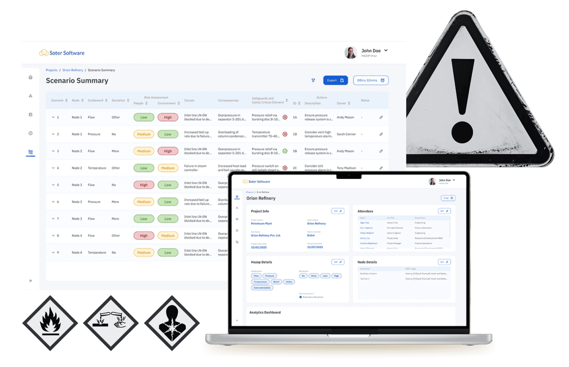
HAZOP Software
HAZOP Software
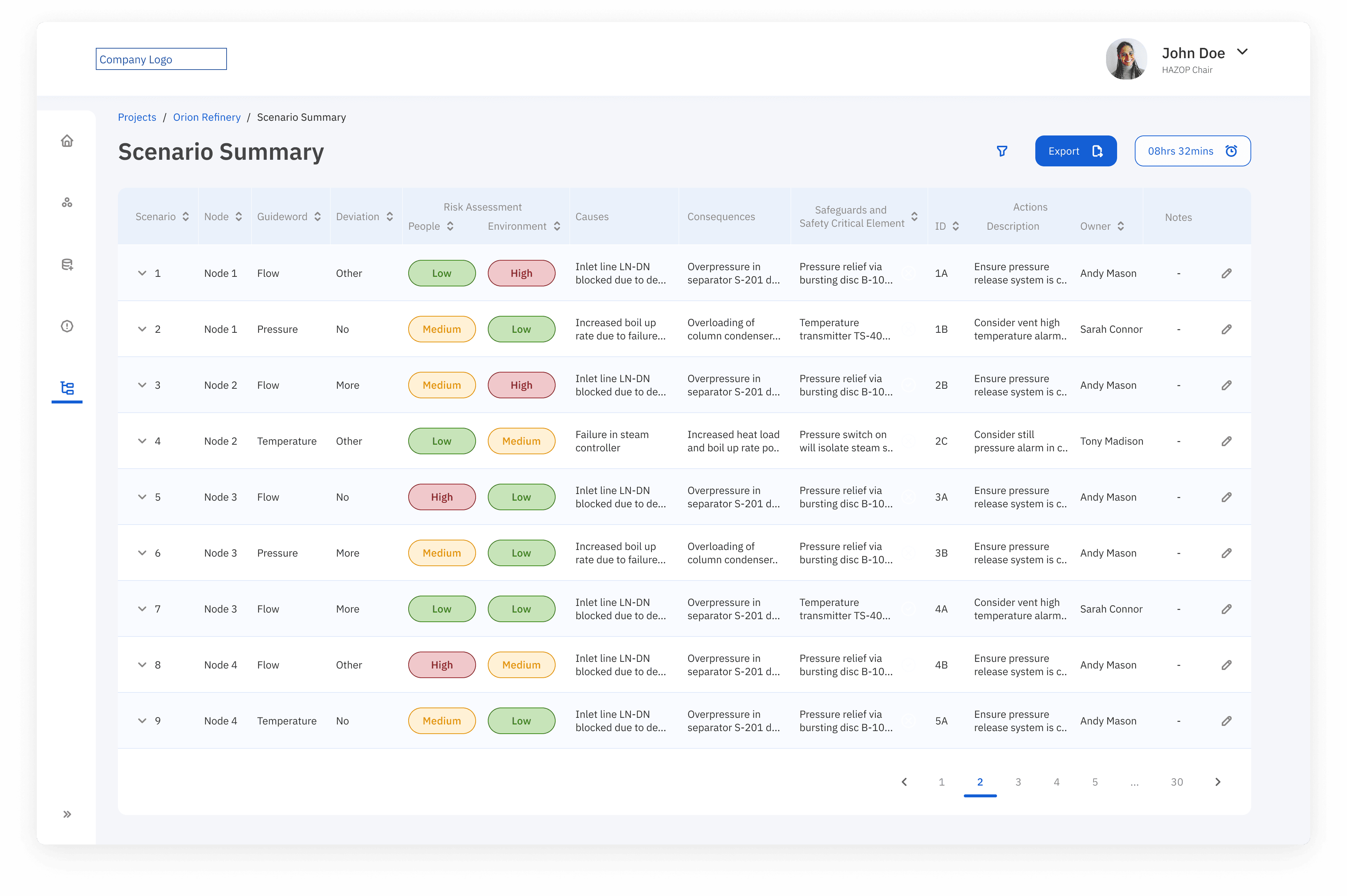
Safety-critical B2B SaaS. Modernising HAZOP workflows for chemical, oil & gas, and pharma industries. 35% improvement in task completion. 28% reduction in user errors.
B2B SaaS
Enterprise UX
Regulated Environment
Complex Workflows
Role
Product Designer & UX Researcher
Team
7 Designers
Client Stakeholders (Soter Safety Consulting)
Marketing Team
Engineering Team

Skills
UX Research & Strategy
UI Development & Design Systems
Stakeholder Communication
Product Launch Roadmap
Go-to-Market Strategy
I along with a team of 6 designers worked with a startup launching the MVP of the software to modernize HAZOP (Hazard and Operability) studies in Process Manufacturing Industries like chemical manufacturing, pharmaceuticals, oil & gas, power generation, water treatment & utilities, and food & beverage manufacturing in order to capture 5% of the UK HAZOP market.

The goal is to replace Excel-based chaos with a streamlined, collaborative platform. The work delivered:

Improvement in Task Completion rates

Reduction in user errors

Fewer iteration cycles via workshop
Reflection & Learning
Working with HAZOP, a complex process for industry outsiders, taught me how to communicate problems and solutions in a simplified, accessible manner.
As the client approached their launch date and we neared our GTM deadline, the pressure of tight timelines combined with limited access to additional resources forced us to think on our feet and make swift, effective decisions.
I learned to strategically leverage each team member's expertise while planning the entire process from research to execution alongside managing communication between the team, college faculty, and clients.
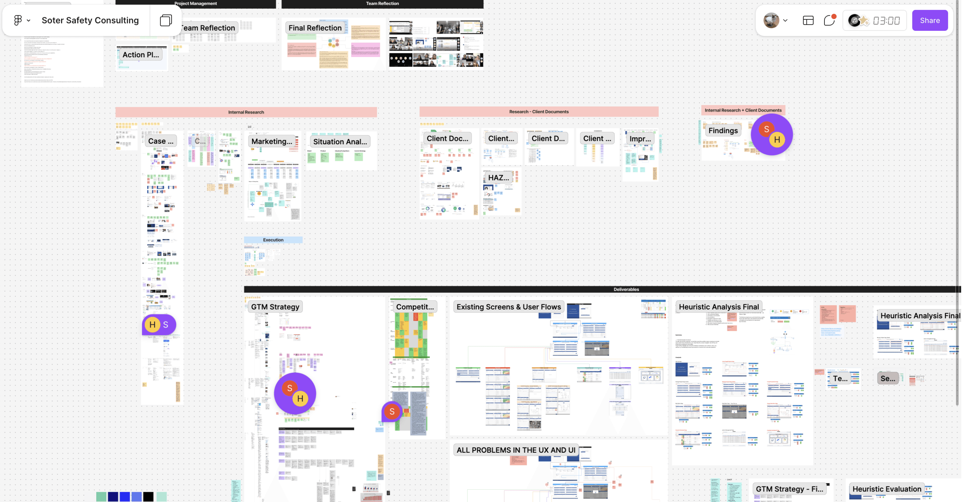
Organising a co-working workshop with the client under tight deadlines was challenging, but it proved highly valuable, allowing us to extract crucial insights directly from the client.
NDA Disclaimer
This project is protected under NDA. For further details, please contact the designer at deepikaraju09@gmail.com.
Behind the scenes
" height="20.287248372093025px" id="oxylnr3h7" transform="translate(2.324 1.363)" width="21.32212093023258px"/><path d="M 0.017 7.911 C 0.017 6.689 0.202 5.602 0.556 4.635 C 0.909 3.667 1.415 2.835 2.072 2.156 C 2.728 1.477 3.52 0.934 4.463 0.56 C 5.406 0.187 6.451 0 7.613 0 C 8.573 0 9.448 0.17 10.223 0.509 C 10.998 0.849 11.655 1.341 12.194 1.969 C 12.733 2.597 13.154 3.361 13.457 4.261 C 13.76 5.161 13.895 6.146 13.895 7.249 L 4.699 7.402 C 4.8 8.081 4.968 8.726 5.221 9.32 C 5.474 9.914 5.811 10.424 6.265 10.848 C 6.72 11.273 7.276 11.595 7.933 11.799 C 8.589 12.003 9.381 12.087 10.307 12.037 C 10.712 12.003 11.183 11.799 11.739 11.442 C 12.295 11.086 12.8 10.526 13.322 9.762 L 13.811 10.186 C 13.423 10.95 12.952 11.595 12.379 12.138 C 11.806 12.682 11.217 13.106 10.594 13.446 C 9.971 13.785 9.347 14.04 8.707 14.193 C 8.067 14.345 7.495 14.43 6.956 14.43 C 5.895 14.43 4.935 14.277 4.076 13.972 C 3.217 13.666 2.493 13.225 1.886 12.682 C 1.28 12.138 0.825 11.442 0.488 10.644 C 0.152 9.847 0 8.947 0 7.962 Z M 4.615 6.4 L 8.168 6.4 C 8.674 6.383 9.078 6.247 9.381 5.976 C 9.684 5.704 9.886 5.399 9.987 5.025 C 10.088 4.652 10.122 4.227 10.072 3.786 C 10.021 3.344 9.869 2.937 9.634 2.563 C 9.398 2.19 9.095 1.884 8.707 1.63 C 8.32 1.375 7.882 1.256 7.377 1.256 C 6.518 1.256 5.827 1.732 5.322 2.665 C 4.817 3.599 4.581 4.838 4.615 6.383 Z" fill="rgb(241, 232, 216)" height="14.430266046511628px" id="GVzvExf12" transform="translate(23.646 7.254)" width="13.894772093023274px"/><path d="M 0.017 7.911 C 0.017 6.689 0.202 5.602 0.556 4.635 C 0.909 3.667 1.415 2.835 2.072 2.156 C 2.728 1.477 3.52 0.934 4.463 0.56 C 5.406 0.187 6.451 0 7.613 0 C 8.573 0 9.448 0.17 10.223 0.509 C 10.998 0.849 11.655 1.341 12.194 1.969 C 12.733 2.597 13.154 3.361 13.457 4.261 C 13.76 5.161 13.895 6.146 13.895 7.249 L 4.699 7.402 C 4.8 8.081 4.968 8.726 5.221 9.32 C 5.474 9.914 5.811 10.424 6.265 10.848 C 6.72 11.273 7.276 11.595 7.933 11.799 C 8.589 12.003 9.381 12.087 10.307 12.037 C 10.712 12.003 11.183 11.799 11.739 11.442 C 12.295 11.086 12.8 10.526 13.322 9.762 L 13.811 10.186 C 13.423 10.95 12.952 11.595 12.379 12.138 C 11.806 12.682 11.217 13.106 10.594 13.446 C 9.971 13.785 9.347 14.04 8.707 14.193 C 8.067 14.345 7.495 14.43 6.956 14.43 C 5.895 14.43 4.935 14.277 4.076 13.972 C 3.217 13.666 2.493 13.225 1.886 12.682 C 1.28 12.138 0.825 11.442 0.488 10.644 C 0.152 9.847 0 8.947 0 7.962 Z M 4.615 6.4 L 8.168 6.4 C 8.674 6.383 9.078 6.247 9.381 5.976 C 9.684 5.704 9.886 5.399 9.987 5.025 C 10.088 4.652 10.122 4.227 10.072 3.786 C 10.021 3.344 9.869 2.937 9.634 2.563 C 9.398 2.19 9.095 1.884 8.707 1.63 C 8.32 1.375 7.882 1.256 7.377 1.256 C 6.518 1.256 5.827 1.732 5.322 2.665 C 4.817 3.599 4.581 4.838 4.615 6.383 Z" fill="rgb(241, 232, 216)" height="14.430266046511628px" id="BaLrnNL1x" transform="translate(37.759 7.254)" width="13.89477209302327px"/><path d="M 0.017 21.543 L 0.017 20.644 L 0.32 20.61 C 0.859 20.542 1.28 20.1 1.6 19.252 C 1.92 18.403 2.072 17.299 2.072 15.958 L 2.072 8.166 C 2.072 7.215 2.055 6.451 2.004 5.857 C 1.954 5.263 1.886 4.787 1.752 4.397 C 1.617 4.007 1.448 3.718 1.213 3.48 C 0.977 3.243 0.69 3.039 0.32 2.852 L 0.017 2.699 L 0.017 2.394 L 5.457 0.153 L 6.299 0.153 L 6.299 1.545 C 6.619 1.137 7.192 0.781 8 0.475 C 8.808 0.17 9.752 0 10.813 0 C 11.655 0 12.446 0.204 13.187 0.594 C 13.928 0.985 14.568 1.528 15.09 2.224 C 15.613 2.92 16.034 3.752 16.32 4.72 C 16.606 5.687 16.741 6.757 16.69 7.928 C 16.657 8.998 16.404 9.931 15.949 10.746 C 15.495 11.561 14.922 12.223 14.232 12.783 C 13.541 13.344 12.783 13.734 11.941 14.006 C 11.099 14.277 10.29 14.413 9.465 14.413 C 8.859 14.413 8.286 14.345 7.73 14.193 C 7.175 14.04 6.686 13.802 6.265 13.48 L 6.265 15.449 C 6.265 16.111 6.299 16.756 6.383 17.367 C 6.467 17.978 6.585 18.522 6.737 18.98 C 6.888 19.438 7.074 19.829 7.293 20.117 C 7.512 20.406 7.747 20.559 8.017 20.593 L 8.354 20.627 L 8.354 21.204 L 8.354 21.543 L 0 21.543 Z M 6.333 10.186 L 6.333 11.222 C 6.552 11.748 6.872 12.155 7.259 12.461 C 7.646 12.766 8.067 12.919 8.488 12.953 C 9.549 12.987 10.392 12.648 11.015 11.901 C 11.638 11.154 11.941 10.101 11.941 8.726 C 11.941 7.758 11.823 6.842 11.587 5.976 C 11.352 5.11 11.032 4.363 10.627 3.735 C 10.223 3.107 9.752 2.631 9.213 2.326 C 8.674 2.02 8.101 1.918 7.495 2.037 C 7.192 2.105 6.939 2.207 6.737 2.343 C 6.535 2.479 6.383 2.631 6.282 2.767 L 6.282 9.931 C 6.282 10.016 6.282 10.118 6.316 10.22 Z" fill="rgb(241, 232, 216)" height="21.543493953488372px" id="Ku1efMAIc" transform="translate(50.778 7.22)" width="16.700881299995043px"/><path d="M 0.017 21.119 L 0.017 20.168 L 0.337 20.134 C 0.943 20.067 1.398 19.574 1.718 18.623 C 2.038 17.673 2.189 16.501 2.189 15.058 C 2.189 14.074 2.156 13.259 2.105 12.631 C 2.055 12.003 1.954 11.493 1.819 11.103 C 1.684 10.712 1.499 10.39 1.246 10.152 C 0.994 9.914 0.691 9.694 0.32 9.49 L 0.034 9.337 L 0.034 9.235 C 0.034 9.235 0 9.117 0 9.015 L 5.726 6.672 L 6.602 6.672 L 6.602 15.262 C 6.602 16.671 6.771 17.826 7.107 18.708 C 7.444 19.591 7.882 20.067 8.421 20.134 L 8.775 20.168 L 8.775 21.119 L 0 21.119 Z M 1.718 2.53 C 1.718 1.749 1.937 1.137 2.375 0.679 C 2.813 0.221 3.419 0 4.16 0 C 4.901 0 5.474 0.221 5.912 0.679 C 6.349 1.137 6.568 1.749 6.568 2.53 C 6.568 3.31 6.349 3.922 5.912 4.38 C 5.474 4.838 4.884 5.059 4.16 5.059 C 3.436 5.059 2.813 4.838 2.375 4.38 C 1.937 3.922 1.718 3.31 1.718 2.53 Z" fill="rgb(241, 232, 216)" height="21.119044465116282px" id="yoc8a1Z0A" transform="translate(66.578 0.549)" width="8.774995348837209px"/><path d="M 8.792 21.204 L 0.017 21.204 L 0.017 20.253 L 0.354 20.253 C 0.927 20.168 1.348 19.676 1.685 18.793 C 2.021 17.91 2.19 16.756 2.19 15.347 L 2.19 8.387 C 2.19 7.402 2.156 6.587 2.105 5.959 C 2.055 5.331 1.954 4.821 1.82 4.431 C 1.685 4.04 1.5 3.718 1.247 3.48 C 0.994 3.243 0.691 3.022 0.32 2.818 L 0.034 2.665 L 0.034 2.563 C 0.034 2.563 0 2.445 0 2.343 L 5.727 0 L 6.602 0 L 6.602 13.276 L 7.327 12.648 C 8.927 11.256 10.105 10.118 10.897 9.218 C 11.689 8.319 11.975 7.843 11.756 7.758 C 11.672 7.724 11.638 7.657 11.638 7.606 L 11.638 6.774 L 16.792 6.774 L 16.792 7.724 L 16.421 7.758 C 15.9 7.792 15.125 8.115 14.114 8.709 C 13.104 9.303 11.925 10.084 10.611 11.086 L 14.249 15.992 C 15.209 17.231 16.135 18.25 17.011 19.014 C 17.887 19.778 18.611 20.185 19.184 20.236 L 19.554 20.27 L 19.554 21.221 L 10.375 21.221 L 10.375 20.27 L 10.56 20.236 C 10.897 20.168 10.847 19.693 10.425 18.793 C 10.005 17.893 9.247 16.756 8.185 15.364 C 7.916 15.007 7.647 14.651 7.394 14.311 C 7.141 13.972 6.889 13.632 6.602 13.259 L 6.602 15.347 C 6.602 16.756 6.771 17.91 7.108 18.793 C 7.445 19.676 7.882 20.151 8.421 20.219 L 8.775 20.253 L 8.775 21.204 Z" fill="rgb(241, 232, 216)" height="21.220965953488367px" id="vWSv8UVGa" transform="translate(74.644 0.464)" width="19.554232558139546px"/><path d="M 0.05 10.691 C 0.05 9.791 0.32 9.044 0.875 8.484 C 1.431 7.924 2.105 7.466 2.896 7.16 C 3.688 6.854 4.547 6.617 5.423 6.481 C 6.299 6.345 7.09 6.277 7.764 6.243 L 7.764 3.833 C 7.764 3.052 7.663 2.424 7.478 1.948 C 7.292 1.473 7.006 1.235 6.669 1.235 C 5.995 1.235 5.507 1.575 5.187 2.237 C 4.867 2.899 4.8 3.782 4.935 4.885 C 4.53 4.987 4.16 5.072 3.806 5.14 C 3.452 5.208 3.132 5.225 2.779 5.225 C 2.459 5.225 2.122 5.191 1.768 5.14 C 1.415 5.089 1.027 4.987 0.572 4.885 C 0.471 4.155 0.572 3.493 0.875 2.882 C 1.179 2.271 1.65 1.744 2.273 1.303 C 2.896 0.862 3.671 0.539 4.58 0.301 C 5.49 0.064 6.518 -0.038 7.629 0.013 C 9.06 0.047 10.206 0.505 11.048 1.354 C 11.89 2.203 12.328 3.374 12.328 4.868 L 12.328 10.216 C 12.328 10.878 12.412 11.404 12.58 11.812 C 12.749 12.219 13.069 12.423 13.54 12.423 C 13.895 12.423 14.164 12.372 14.366 12.253 C 14.568 12.134 14.72 11.981 14.82 11.778 L 15.275 12.372 C 14.905 13.051 14.383 13.594 13.675 14.002 C 12.968 14.409 11.94 14.613 10.576 14.613 C 9.97 14.613 9.431 14.477 8.976 14.205 C 8.522 13.934 8.219 13.56 8.05 13.085 C 7.511 13.441 6.888 13.747 6.147 14.036 C 5.406 14.324 4.631 14.46 3.806 14.46 C 3.233 14.46 2.711 14.358 2.24 14.154 C 1.768 13.951 1.364 13.679 1.044 13.34 C 0.724 13 0.455 12.61 0.269 12.151 C 0.084 11.693 0 11.234 0 10.759 Z M 4.379 9.978 C 4.379 10.708 4.598 11.251 5.035 11.642 C 5.473 12.032 5.979 12.219 6.518 12.219 C 6.989 12.219 7.41 12.083 7.815 11.812 L 7.78 7.109 C 7.343 7.109 6.939 7.16 6.535 7.262 C 6.13 7.364 5.776 7.533 5.44 7.771 C 5.103 8.009 4.85 8.314 4.665 8.671 C 4.48 9.027 4.379 9.469 4.379 9.978 Z" fill="rgb(241, 232, 216)" height="14.61285214100569px" id="OvcUOZ59M" transform="translate(92.851 7.259)" width="15.275162790697678px"/><path d="M 0.051 10.691 C 0.051 9.791 0.32 9.044 0.876 8.484 C 1.431 7.924 2.105 7.466 2.896 7.16 C 3.688 6.854 4.547 6.617 5.423 6.481 C 6.299 6.345 7.091 6.277 7.764 6.243 L 7.764 3.833 C 7.764 3.052 7.663 2.423 7.478 1.948 C 7.292 1.473 7.006 1.235 6.669 1.235 C 5.996 1.235 5.507 1.575 5.187 2.237 C 4.867 2.899 4.8 3.782 4.935 4.885 C 4.531 4.987 4.16 5.072 3.806 5.14 C 3.452 5.208 3.132 5.225 2.779 5.225 C 2.459 5.225 2.122 5.191 1.768 5.14 C 1.415 5.089 1.027 4.987 0.572 4.885 C 0.471 4.155 0.572 3.493 0.876 2.882 C 1.179 2.271 1.651 1.744 2.273 1.303 C 2.896 0.862 3.671 0.539 4.581 0.301 C 5.491 0.064 6.518 -0.038 7.629 0.013 C 9.06 0.047 10.206 0.505 11.048 1.354 C 11.891 2.203 12.328 3.374 12.328 4.868 L 12.328 10.216 C 12.328 10.878 12.412 11.404 12.581 11.812 C 12.749 12.219 13.069 12.423 13.541 12.423 C 13.895 12.423 14.164 12.372 14.366 12.253 C 14.568 12.134 14.72 11.981 14.821 11.778 L 15.276 12.372 C 14.905 13.051 14.383 13.594 13.676 14.002 C 12.968 14.409 11.94 14.613 10.576 14.613 C 9.971 14.613 9.431 14.477 8.976 14.205 C 8.522 13.934 8.219 13.56 8.051 13.085 C 7.511 13.441 6.888 13.747 6.147 14.036 C 5.406 14.324 4.631 14.46 3.806 14.46 C 3.233 14.46 2.711 14.358 2.24 14.154 C 1.768 13.951 1.364 13.679 1.044 13.34 C 0.724 13 0.455 12.61 0.269 12.151 C 0.084 11.693 0 11.234 0 10.759 Z M 4.379 9.978 C 4.379 10.708 4.598 11.251 5.036 11.642 C 5.473 12.032 5.979 12.219 6.518 12.219 C 6.989 12.219 7.411 12.083 7.815 11.812 L 7.781 7.109 C 7.343 7.109 6.939 7.16 6.535 7.262 C 6.131 7.364 5.776 7.533 5.44 7.771 C 5.103 8.009 4.851 8.314 4.665 8.671 C 4.48 9.027 4.379 9.469 4.379 9.978 Z" fill="rgb(241, 232, 216)" height="14.612785519137272px" id="YtF1O_UoZ" transform="translate(107.722 7.275)" width="15.275906976744182px"/><path d="M 0.017 19.914 C 0.017 19.676 0.017 19.54 0.051 19.472 L 0.051 19.32 L 0.37 19.286 C 0.943 19.218 1.381 18.742 1.701 17.859 C 2.021 16.977 2.189 15.822 2.189 14.413 L 2.189 5.857 C 2.189 4.448 2.021 3.293 1.701 2.411 C 1.381 1.528 0.926 1.053 0.37 0.985 L 0.051 0.951 L 0.051 0.798 C 0.051 0.798 0.017 0.594 0.017 0.356 L 0.017 0 L 10.981 0 C 12.295 0 13.491 0.136 14.568 0.39 C 15.646 0.645 16.556 1.019 17.297 1.494 C 18.038 1.969 18.627 2.547 19.048 3.226 C 19.47 3.905 19.655 4.669 19.655 5.5 C 19.655 6.112 19.554 6.723 19.335 7.334 C 19.116 7.945 18.812 8.505 18.408 9.032 C 18.004 9.558 17.499 10.016 16.892 10.424 C 16.286 10.831 15.612 11.154 14.871 11.391 C 15.208 11.799 15.579 12.274 16 12.817 C 16.421 13.361 16.859 13.938 17.331 14.532 C 17.802 15.126 18.307 15.72 18.83 16.298 C 19.351 16.875 19.874 17.418 20.396 17.876 C 20.918 18.335 21.457 18.708 21.979 18.997 C 22.501 19.286 23.023 19.421 23.495 19.421 L 23.495 20.253 L 21.861 20.253 C 20.514 20.253 19.47 20.236 18.695 20.185 C 17.92 20.134 17.28 20.016 16.758 19.795 C 16.236 19.574 15.764 19.235 15.343 18.793 C 14.922 18.352 14.383 17.724 13.743 16.892 C 12.783 15.67 11.924 14.685 11.183 13.955 C 10.442 13.225 9.836 12.563 9.381 11.969 L 7.091 11.969 L 7.091 14.379 C 7.091 15.788 7.259 16.943 7.596 17.826 C 7.933 18.708 8.387 19.184 8.943 19.252 L 9.229 19.286 C 9.229 19.286 9.229 19.387 9.263 19.438 L 9.263 20.236 L 0 20.236 L 0 19.88 Z M 7.124 10.729 L 10.206 10.729 C 10.88 10.729 11.47 10.593 11.991 10.305 C 12.514 10.016 12.968 9.643 13.339 9.167 C 13.71 8.692 13.996 8.132 14.198 7.504 C 14.4 6.876 14.501 6.196 14.501 5.5 C 14.501 4.193 14.181 3.158 13.541 2.394 C 12.901 1.63 12.042 1.256 10.981 1.256 L 7.107 1.256 L 7.107 10.729 Z" fill="rgb(241, 232, 216)" height="20.253246511627903px" id="CBn0tZ4Az" transform="translate(63.326 24.825)" width="23.494846511627884px"/><path d="M 0 10.725 C 0 9.808 0.269 9.078 0.825 8.501 C 1.381 7.924 2.055 7.483 2.847 7.177 C 3.638 6.871 4.497 6.634 5.389 6.498 C 6.282 6.362 7.057 6.294 7.748 6.26 L 7.748 3.85 C 7.748 3.069 7.647 2.44 7.461 1.965 C 7.276 1.49 6.989 1.252 6.653 1.252 C 5.979 1.252 5.491 1.592 5.171 2.254 C 4.851 2.916 4.784 3.816 4.918 4.902 C 4.514 5.004 4.127 5.089 3.789 5.157 C 3.453 5.225 3.116 5.242 2.762 5.242 C 2.442 5.242 2.089 5.208 1.752 5.157 C 1.415 5.106 1.011 5.004 0.556 4.902 C 0.455 4.172 0.556 3.51 0.859 2.882 C 1.162 2.254 1.633 1.727 2.257 1.303 C 2.88 0.879 3.655 0.539 4.564 0.301 C 5.473 0.064 6.501 -0.038 7.629 0.013 C 9.061 0.047 10.207 0.505 11.065 1.354 C 11.924 2.203 12.345 3.391 12.345 4.868 L 12.345 10.233 C 12.345 10.895 12.429 11.421 12.598 11.829 C 12.767 12.236 13.087 12.44 13.558 12.44 C 13.912 12.44 14.181 12.389 14.384 12.27 C 14.585 12.151 14.737 11.998 14.838 11.795 L 15.293 12.389 C 14.922 13.068 14.384 13.611 13.693 14.019 C 13.002 14.426 11.958 14.63 10.593 14.63 C 9.971 14.63 9.449 14.494 8.993 14.222 C 8.539 13.951 8.236 13.577 8.068 13.102 C 7.529 13.458 6.905 13.764 6.164 14.053 C 5.424 14.341 4.649 14.477 3.824 14.477 C 3.251 14.477 2.729 14.375 2.257 14.171 C 1.785 13.968 1.381 13.696 1.061 13.357 C 0.741 13.017 0.472 12.61 0.287 12.168 C 0.101 11.727 0.017 11.251 0.017 10.776 Z M 4.329 10.012 C 4.329 10.742 4.548 11.285 4.985 11.676 C 5.424 12.066 5.929 12.253 6.484 12.253 C 6.956 12.253 7.393 12.117 7.781 11.846 L 7.748 7.143 C 7.309 7.143 6.905 7.194 6.501 7.296 C 6.097 7.398 5.744 7.567 5.407 7.805 C 5.069 8.043 4.817 8.348 4.615 8.705 C 4.413 9.061 4.329 9.503 4.329 10.029 Z" fill="rgb(241, 232, 216)" height="14.629803935077028px" id="M4IOFe8nm" transform="translate(85.574 30.703)" width="15.293023255813964px"/><path d="M 0.068 27.978 C 0.758 27.74 1.348 27.468 1.819 27.163 C 2.291 26.857 2.661 26.433 2.948 25.89 C 3.233 25.346 3.436 24.65 3.537 23.801 C 3.638 22.953 3.705 21.849 3.705 20.525 C 3.722 19.727 3.739 18.997 3.739 18.352 L 3.739 13.615 C 3.739 12.767 3.705 12.087 3.655 11.544 C 3.604 11.001 3.504 10.56 3.369 10.203 C 3.233 9.847 3.049 9.558 2.813 9.354 C 2.577 9.151 2.273 8.947 1.904 8.76 L 1.584 8.607 L 1.584 8.505 C 1.584 8.505 1.549 8.387 1.549 8.285 L 7.293 5.942 L 8.169 5.942 L 8.169 15.5 C 8.169 16.213 8.169 16.841 8.169 17.401 C 8.169 17.961 8.169 18.59 8.169 19.286 C 8.169 20.746 8.051 21.951 7.798 22.936 C 7.545 23.92 7.124 24.735 6.518 25.414 C 5.912 26.093 5.137 26.687 4.144 27.18 C 3.149 27.672 1.92 28.147 0.438 28.64 L 0 28.012 Z M 4.042 2.156 C 4.042 1.494 4.228 0.968 4.598 0.577 C 4.969 0.187 5.473 0 6.097 0 C 6.72 0 7.242 0.187 7.613 0.577 C 7.984 0.968 8.169 1.494 8.169 2.156 C 8.169 2.818 7.984 3.344 7.613 3.735 C 7.242 4.125 6.737 4.312 6.097 4.312 C 5.457 4.312 4.969 4.125 4.598 3.735 C 4.228 3.344 4.042 2.818 4.042 2.156 Z" fill="rgb(241, 232, 216)" height="28.639776744186047px" id="mUVye375G" transform="translate(97.296 24.74)" width="8.168930232558125px"/><path d="M 0 0.374 L 0 0.017 L 6.602 0.017 L 6.602 9.134 C 6.602 9.88 6.855 10.458 7.36 10.899 C 7.865 11.341 8.623 11.561 9.616 11.561 C 9.852 11.561 10.055 11.51 10.24 11.391 C 10.425 11.273 10.593 11.137 10.745 10.967 L 10.745 6.095 C 10.762 4.652 10.611 3.463 10.291 2.513 C 9.971 1.562 9.516 1.053 8.926 0.985 L 8.64 0.951 L 8.64 0.798 C 8.64 0.798 8.606 0.594 8.606 0.357 L 8.606 0 L 15.175 0 L 15.175 6.078 C 15.175 7.045 15.191 7.843 15.242 8.488 C 15.292 9.134 15.376 9.626 15.511 10.016 C 15.646 10.407 15.831 10.729 16.084 10.967 C 16.336 11.205 16.64 11.425 17.011 11.612 L 17.331 11.765 C 17.331 11.765 17.331 11.816 17.364 11.867 L 17.364 12.087 L 11.671 14.43 L 10.762 14.43 L 10.762 11.833 C 10.105 12.699 9.415 13.378 8.656 13.853 C 7.899 14.328 7.056 14.583 6.147 14.583 C 4.833 14.583 3.84 14.125 3.183 13.225 C 2.526 12.325 2.189 11.103 2.189 9.575 L 2.189 5.84 C 2.189 4.431 2.02 3.277 1.7 2.394 C 1.38 1.511 0.926 1.036 0.371 0.968 L 0.051 0.934 L 0.051 0.781 C 0.051 0.781 0.016 0.577 0.016 0.34 Z" fill="rgb(241, 232, 216)" height="14.58306976744186px" id="hf5ny0HYg" transform="translate(105.685 30.665)" width="17.36409302325579px"/></svg>)